
matplotlib
matplotlib とは、Python 用のグラフ描画ライブラリです。
初めに
本記事では、機械学習/科学計算/データ分析でよく利用する matplotlib の紹介です。
その他の記事は以下をご覧ください。


matplotlib のインストール
以下のいずれかの方法で matplotlib をインストールします。
pip コマンドを利用しない方法
Advance AI with Open Source | Anaconda
Anaconda is the birthplace of Python data science. We are a movement of data scientists, data-driven enterprises, and op...
www.anaconda.com
pip コマンドを利用する方法
pip install matplotlib
matplotlib の使い方
本記事では、以下のライブラリをインポートしている前提で話を進めます。
import matplotlib.pylab as plt
import numpy as np
必要に応じて、ソースコードに上記の import 文を追加してください。
グラフの作成
ここでは、グラフの描写方法を紹介します。
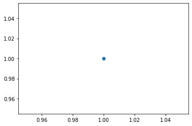
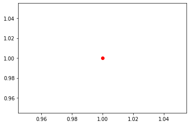
点を打つ
plt.plot(1, 1, marker='o') #x, y, オプション(marker=点の形)の順
plt.show()
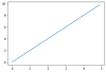
2次元グラフを描画
x = np.arange(0, 5, 0.1) #0~5まで 0.1 刻みで生成
y = 2 * x

plt.plot(x, y) #2次元グラフ
plt.show()
複数のグラフを描画
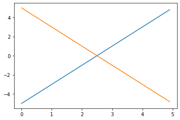
x1 = np.arange(0, 5, 0.1) #0~5まで 0.1 刻みで生成
y1 = 2 * x1 -5

x2 = np.arange(0, 5, 0.1) #0~5まで 0.1 刻みで生成
y2 = -2 * x2 +5

plt.plot(x1, y1) #1つ目のグラフ
plt.plot(x2, y2) #2つ目のグラフ
plt.show()
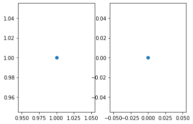
複数のグラフ領域 (axes) を横に作成
fig = plt.figure()

ax1 = fig.add_subplot(121) #1行2列の1番目
ax1.plot(1,1, marker='o')

ax2 = fig.add_subplot(122) #1行2列の2番目
ax2.plot(0, 0, marker='o')

plt.show()
fig.add_subplot の引数は (行、列、場所) を表します。
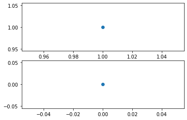
複数のグラフ領域 (axes) を縦に作成
fig = plt.figure()

ax1 = fig.add_subplot(211) #2行1列の1番目
ax1.plot(1,1, marker='o')

ax2 = fig.add_subplot(212) #2行1列の2番目
ax2.plot(0, 0, marker='o')

plt.show()
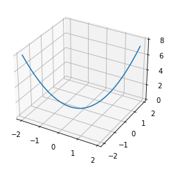
3次元のグラフを描画
fig = plt.figure()
ax = fig.add_subplot(111, projection='3d') #3次元グラフ

x = np.arange(-2.0, 2.0, 0.1)
y = np.arange(-2.0, 2.0, 0.1)
z = x **2 + y**2

ax.plot(x, y, z)
plt.show()
ワイヤーフレームを描画
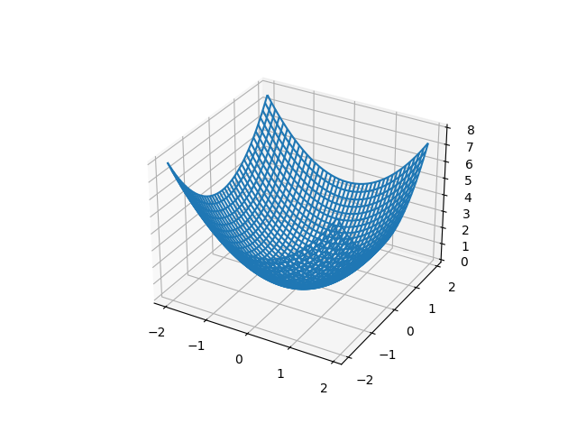
fig = plt.figure()
ax = fig.add_subplot(projection='3d') #3次元グラフ

x = np.arange(-2.0, 2.0, 0.1)
y = np.arange(-2.0, 2.0, 0.1)

X, Y = np.meshgrid(x, y)
Z = X**2 + Y**2

ax.plot_wireframe(X, Y, Z) #ワイヤーフレーム

plt.show()
マーカーの設定
ここでは、マーカーの設定を紹介します。
形を変える
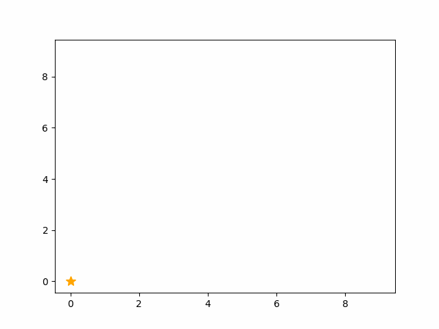
plt.plot(1, 1, marker='*') #マーカーの形

plt.show()

なお、マーカーの一覧は以下です。

matplotlib.markers — Matplotlib 3.10.8 documentation
matplotlib.org
色を変える
plt.plot(1, 1, color='red', marker='o') #color で色を変更

plt.show()
なお、以下の方法で色と形を一括で指定できます。
plt.plot(1, 1, 'ro') #r = color が red, o = maker が 'o' を表す

plt.show()
サイズを変える
plt.plot(1, 1, marker='o', markersize=100) #マーカーのサイズ変更

plt.show()
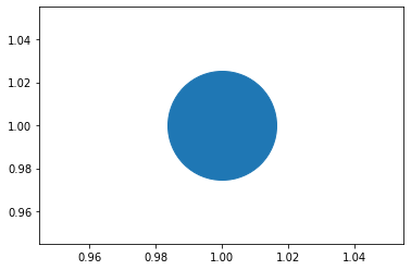
なお、markersize の代わりに ms でも同様機能となります。
軸や目盛の設定
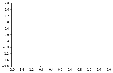
目盛の範囲を制限
plt.xlim(-2,2) #x軸の範囲
plt.ylim(-2,2) #y軸の範囲

plt.show()
目盛の間隔
plt.xticks(np.arange(-2.0, 2.1, 0.4)) #x軸の目盛の間隔
plt.yticks(np.arange(-2.0, 2.1, 0.4)) #y軸の目盛の間隔

plt.show()
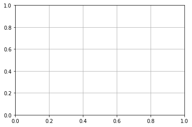
補助線 (グリッド)
plt.grid() #補助線

plt.show()
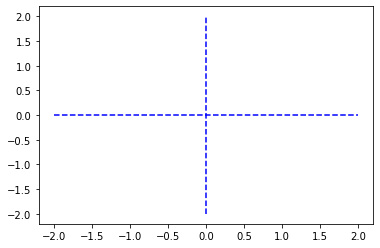
0の軸線
plt.plot( [-2, 2], [0,0], '--b')
plt.plot( [0,0], [-2, 2], '--b')

plt.show()
アニメーション
matplotlib のアニメーションは次の2種類があります。
- ArtistAnimation:アニメーションで利用する全てのグラフを配列に格納
- FuncAnimation:1フレームごとに関数でグラフを生成
ArtistAnimation
#jupyter notebook でアニメーションを再生する場合
import matplotlib.animation as animation
%matplotlib nbagg

fig = plt.figure()

ims = []
for i in range(10):
        graph = plt.plot(i,i, marker='*')             # グラフを作成
        ims.append(graph)                  # グラフを配列に格納

ani = animation.ArtistAnimation(fig, ims, interval=100) #100msごとに配列のグラフを切り替え
plt.show()
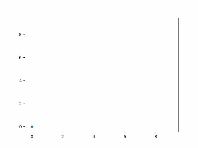
FuncAnimation
#jupyter notebook でアニメーションを再生する場合
%matplotlib nbagg

x = np.arange(0, 10.0, 1)
y = np.arange(0, 10.0, 1)
fig = plt.figure()
ax = fig.add_subplot(111)
line, = ax.plot(x, y, '*', color='orange', markersize=10) #カンマは Line2D "リストの先頭" を代入

def func(i):
    line.set_data(i,i)
    return line,

ani = animation.FuncAnimation(fig, func, frames=10, interval=100, blit=True) #10個のグラフを100msごとに blitting 手法で描写
ani.save('fig2.gif', writer="pillow")
plt.show()
関連記事
機械学習/科学計算/データ分析でよく利用するツールやライブラリは以下をご覧ください。
ディープラーニングに関する記事は以下のとおりです。
- 【ディープラーニング入門1】AI・機械学習・ディープラーニングとは
- 【ディープラーニング入門2】パーセプトロン・ニューラルネットワーク
- 【ディープラーニング入門3】バックプロパゲーション (誤差逆伝播法)
- 【ディープラーニング入門4】学習・重み・ハイパーパラメータの最適化
- 【ディープラーニング入門5】畳み込みニューラルネットワーク (CNN)